


Visitors Aren’t Clicking? Here’s the UX Fix You Actually Need
Low conversions, high bounce rate? The problem might not be your product—it’s your UX. Discover how better design and user experience can turn visitors into customers.
If Your Website Looks Great But Isn’t Working, You’ve Got a UX Problem
So you’ve got the brand visuals.
The color palette sings. The copy is tight. The dev team crushed the build.
And still…
People bounce.
Forms go unfilled.
Leads vanish into the abyss.
We’ve seen it more times than we can count:
Your website isn’t converting—not because it’s ugly. But because it’s emotionally flat, UX-confused, and friction-heavy.
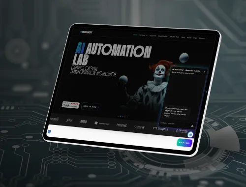
Here’s how we fix that at Qquench.
Why Beautiful Websites Fail to Convert
1. They Make the User Work Too Hard
If your visitor has to think, dig, or decode what to do next…
they won’t.
UX truth: every second of hesitation = conversion lost.

2. The Flow Doesn’t Match the Feeling

Great UX mirrors emotion.
If someone comes curious and lands on confusion? They’re gone.
What works: Story-driven flow.
We choreograph pages like scenes—with curiosity, clarity, and calm CTA cues.
3. Your CTA Is Either Too Loud or Too Late
Pop-ups screaming “BOOK A DEMO” before someone even knows what you do?
Hard no.
What works: Contextual nudges that feel natural—not needy.

The Qquench UX Framework for Fixing Conversions
Step 1 – Map the Emotional Journey, Not Just the Click Path
We ask:
- What’s the user feeling at each scroll?
- Where does anxiety spike?
- Where do they want reassurance?
Then we design for that—not just for clicks.

Step 2 – Say Less, But Say It Better

We edit hero sections down to their emotional punchline.
Strip jargon. Keep value.
CTA? One. Clear. Centered.
Step 3 – Build Visual Clarity (Not Just Visuals)
We fix the page hierarchy so that eyes land where they’re supposed to.
We use whitespace to create rhythm, not emptiness.
And we use visual anchors to reduce scroll fatigue.

Your Website Isn’t a Brochure. It’s a Conversation.
The question isn’t “Is it pretty?”
It’s “Does it pull me in? Does it make me trust, act, return?”
At Qquench, we build UX that doesn’t just delight—it delivers.
Ready to turn bounce into belief?
