


Mobile-first design is no longer enough. Discover what’s replacing it and how smart UX teams are designing for fluid, human-first experiences across all screens.
“Make it mobile-first” used to be a power move.
Now? It’s just table stakes.
Designing for the smallest screen was once revolutionary. But in 2025, users aren’t mobile-first — they’re fluid-first. They’re switching from phone to tablet to desktop to smartwatch (and back again) without thinking twice.
And if your design doesn’t flex emotionally and functionally across that flow?
You’re already behind.
At Qquench, we’ve traded mobile-first for something better: moment-first UX.
Here’s why that matters.
1. Mobile-First Was a Reaction. It’s Time for Proactive Design
Mobile-first emerged when desktop bloat made mobile sites unbearable.
But now we face a different problem:
Apps that “fit” on phones — but don’t feel right for users who expect personalization, emotion, and anticipation.
We don’t just design for screens.
We design for states — distracted, focused, bored, stressed, curious.
See also: Google’s Micro-Moments UX philosophy.

2. Screen Size ≠ Context

Designing mobile-first assumes one thing: you know what device your user is using.
But what about:
- A parent learning while cooking on a tablet?
- A warehouse manager glancing at a wrist UI mid-task?
- A field agent working offline on a rugged device in low light?
Screen size doesn’t tell you the situation — and that’s where most designs fail.
We design for contextual intent, not just device resolution.
3. Why Smart UX Today Is “Moment-Aware”
We build what we call moment-aware interfaces. They ask:
- What emotional state is the user in?
- What cognitive load are they juggling?
- What happens before and after this interaction?
Designing for a moment means understanding that someone checking progress on a smartwatch is not in the same headspace as someone exploring a new LMS module on a laptop.

4. One Flow to Rule Them All? Nope. We Design Multi-Flows

Forget one-size-fits-all.
We craft multi-flow journeys:
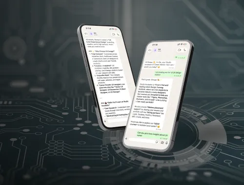
- A bite-sized, swipeable version of a course for a commuting learner.
- A rich, immersive flow for a weekend deep-dive on desktop.
- A minimalist audio-forward version for field learning.
Same objective. Different interfaces.
Each one intentional.
Also inspired by: Adaptive UX practices
5. The Qquench Difference: From Mobile-First to Mindset-First
We’ve stopped thinking about screens as destinations.
We think of them as expression points in a bigger emotional journey.
Our UX isn’t about fitting into devices.
It’s about guiding humans through moods, choices, and context shifts.
That’s not mobile-first.
That’s human-first.
And it works.

Mobile-First Is Over. Moment-First Is Here
So no, we don’t call ourselves “mobile-first designers.”
We design for flow. For friction. For focus. For fatigue.
For the very real moments that your user is moving through.
At Qquench, we don’t just fit into screens.
We fit into lives.
