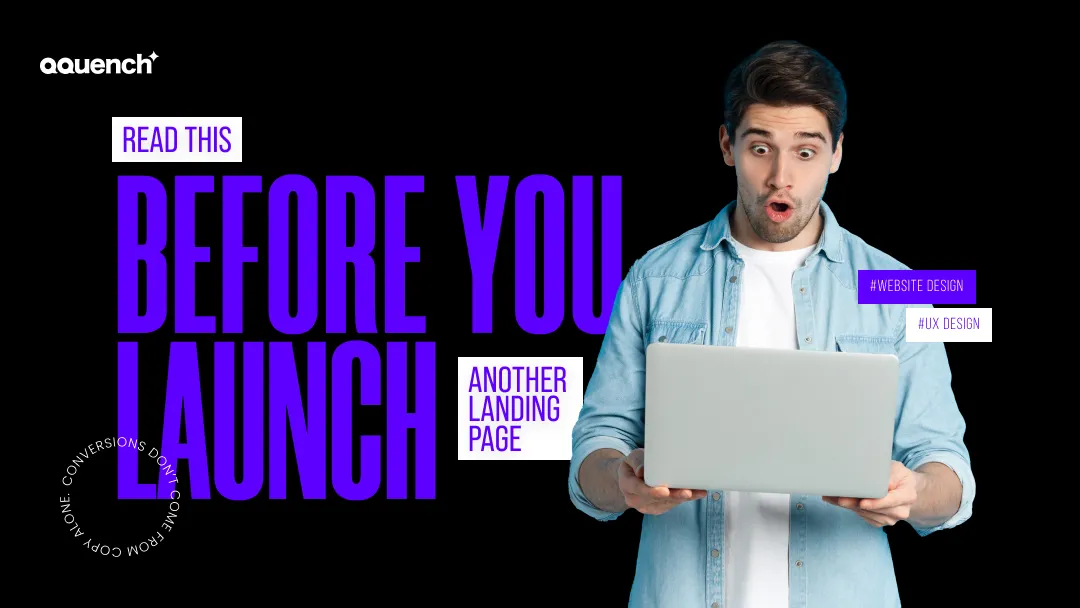
Conversions Don’t Come From Copy Alone.
Design can be stunning. UX can be intuitive.
But if your page takes 4 seconds to load?
But here’s the thing:
Most landing pages don’t fail because of what they say.
They fail because of what they assume.
At Qquench, we treat landing pages like conversion choreography — every scroll, pause, and CTA placed with purpose.
Here’s what to check before you press publish.
Mistake #1: Designing for Desktop First
Over 65% of users will see your landing page on a phone.
Yet most pages are still:
- Scroll-heavy
- Button-invisible
- Info-packed like a pitch deck
Fix: Build mobile-first, with tap-priority layouts and CTA placements designed for thumbs.

Mistake #2: Too Many CTAs, Not Enough Clarity

“Book a demo!”
“Start your free trial!”
“Download the guide!”
“Follow us!”
When everything is a priority… nothing is.
Fix: One page = one primary action.
Everything else supports or steps aside.
Mistake #3: Visuals That Don’t Do Work
Hero banners with happy people? Cool. But what does that tell me?
Visuals need to:
- Convey outcomes
- Trigger emotion
- Make your value proposition feel real
Fix: Use images that answer objections, show before-and-after states, or display interface flow.

Mistake #4: Overcomplicated Forms
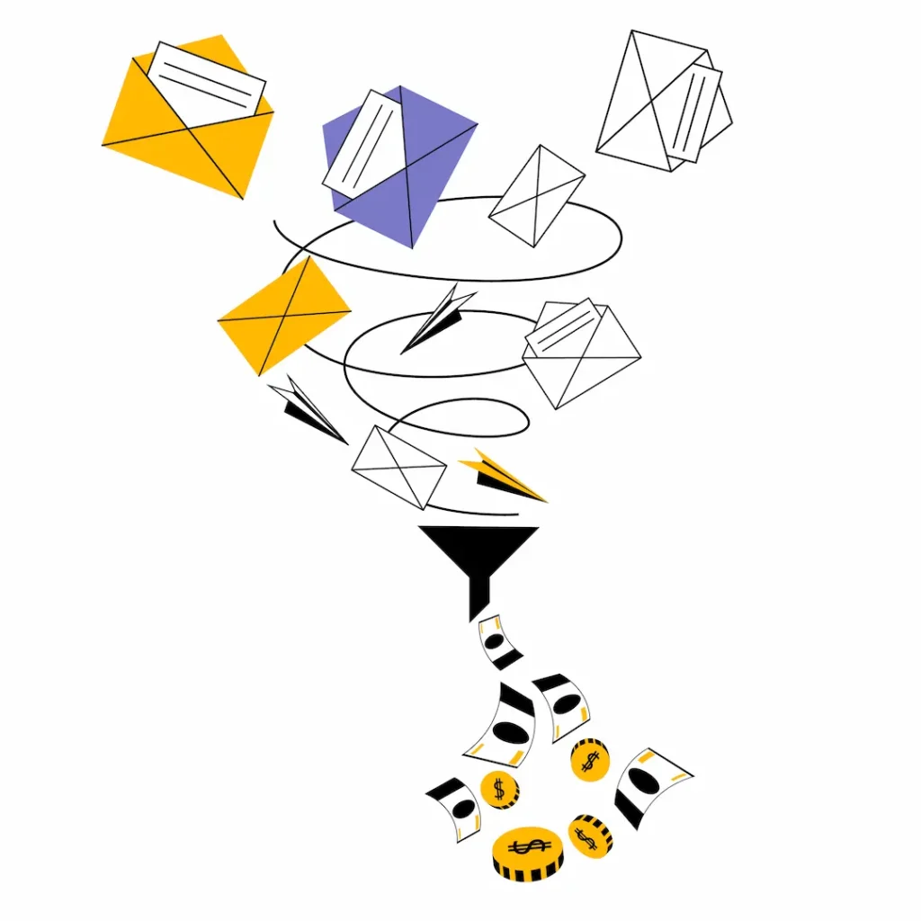
Asking for company size, revenue, industry, phone number, and a 200-word project brief?
That’s not lead capture. That’s user fatigue.
- Use progressive disclosure (start small, expand later)
- Auto-fill or pre-select fields when possible
- Add microcopy: “Takes less than 30 seconds” → reduces abandonment
The Qquench Framework: Conversion-First Page Design
Here’s how we build landing pages that perform:
- Intent Anchoring
What brought them here? Design for that intent first. - Value Prop Stacking
Build belief step-by-step: hook → proof → benefit → CTA - Clarity Over Cleverness
Clear beats cute. Every time. - CTA Pacing
CTA above the fold. Reminder mid-scroll. Reinforce at bottom. - Emotional Microcopy
Use second-person language, urgency cues, and trust signals.
Case Snapshot: A Page That Tripled Its Conversion Rate
Before:
- “Learn More” CTA
- Generic hero image
- 7-field form
- No clear scroll structure
After our rebuild:
- Intent-specific headline
- Visuals showing user interface + results
- 3-field micro-form with tiered questions
- Trust anchors (logos, testimonials) spaced across scroll
Result?
- 3x increase in signups
- 40% drop in bounce rate
- “I actually wanted to fill the form” — user feedback
Launching a Landing Page Without Strategy Is Just… Launching a Page
If your landing page doesn’t guide users toward one clear decision, it’s not landing anything.
Let’s Build a Page That Actually Performs
Qquench designs landing experiences that are measured in clicks, not compliments — with tested UX, messaging flow, and behavior design.
Qquench: Pages that land results. Not just load.
#LandingPageDesign #ConversionUX #CTAClarity #PerformanceDesign #BuiltByQquench
What’s the most frustrating landing page experience you’ve had? Too many fields? Too much hype? Drop it below.